
Case Study
Nordic
Home
Solutions
About the project
A quiet space
for quality things.
This was a practice project and the company was created by me and with the help of AI. Nordic Home Solutions is an e-commerce brand for Scandinavian-designed home goods like furniture, textiles, and small objects that make everyday life a little more considered.
The idea was to create a website that felt as calm like the nature in Scandinavia. Nothing extra. Clean grids, generous whitespace, and a restrained palette that would the photography do some the talking.
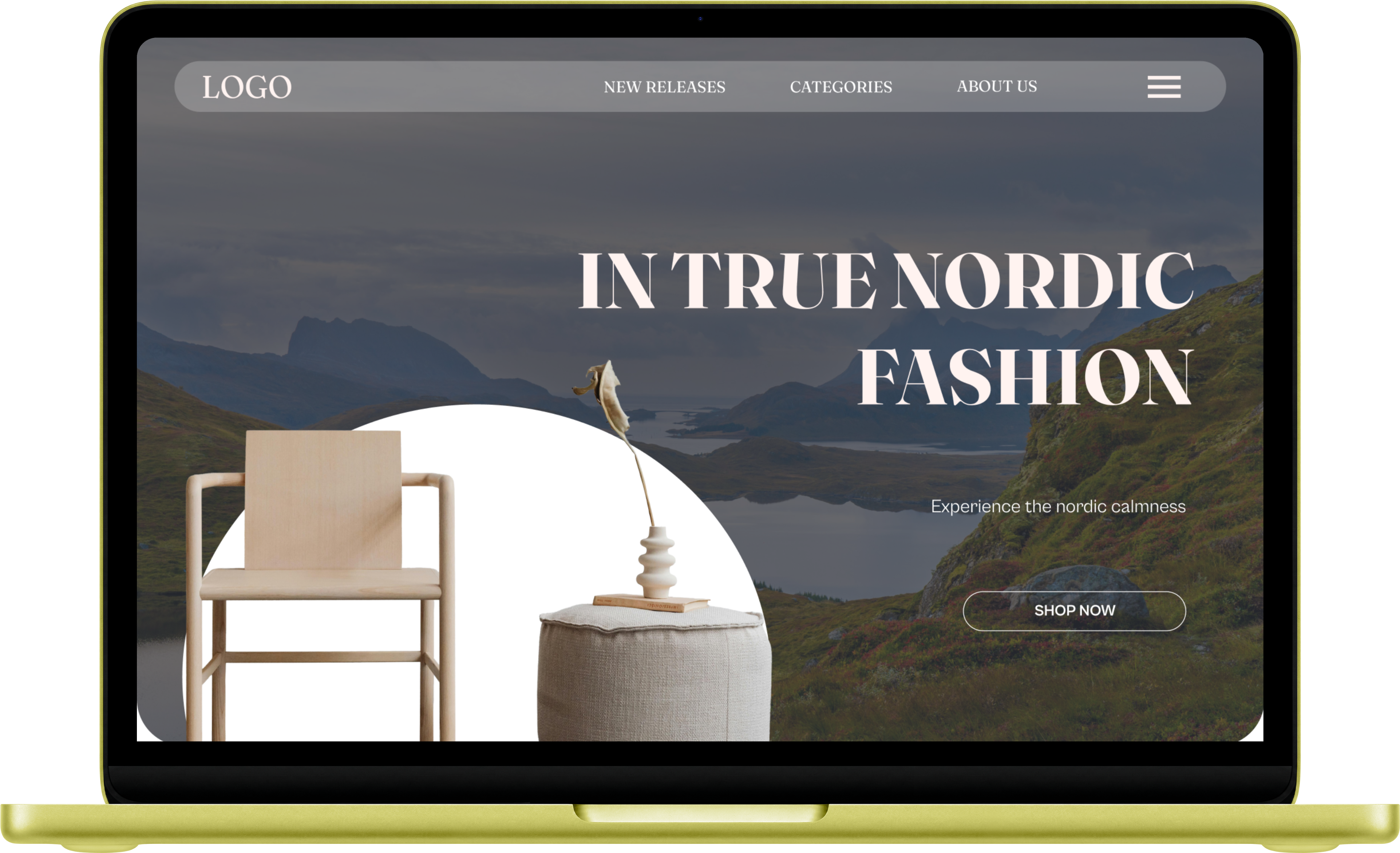
Visual showcase
The design
.png)
Design detail
Why I chose
what I did.
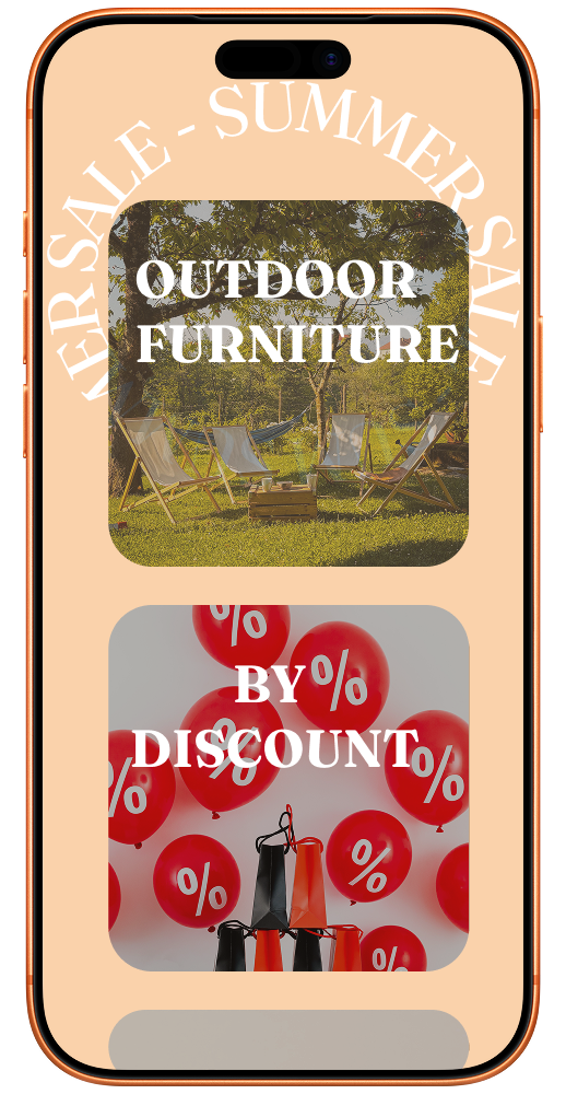
The nordic style is often referred to blue, beige and bright. I decided to try to blend those colors together. The curve for the "Summer sale" was inspired by the midsummer flower wreaths people often create.
Cool slate blues draw from Scandinavian winter light, while the off-white backgrounds keep everything airy and breathable.
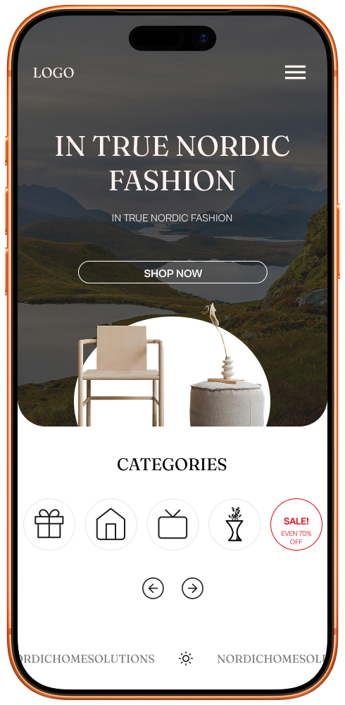
Mobile designs
Designed with clarity first, every layout built around the product.
How I worked
The process
Colour palette & typography
The colours
A restrained Nordic palette — cool blues and slates drawn from Scandinavian winter light, grounded by near-black ink and a barely-warm off-white.