Case Study — Outdoor & Nature
Into the wild. Built to last.
About the project
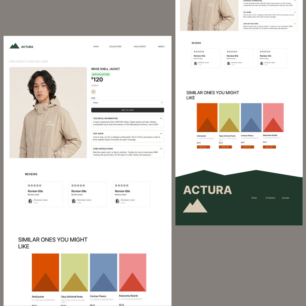
Actura started as a university project. I was tasked with building a company from scratch, brand and all. I revisited it later to push the website to something that actually felt professional, not like a school assignment.
The brand is for people who go past the comfortable trail markers, but also for the person hiking a local park on a Sunday. Not a gear-flex outdoor brand, not generic REI-core. Rugged, earned, unisex. Same products across the board, with a handful of cuts adjusted for fit.
That meant the visual language had to carry weight without shouting. Deep greens, near-black backgrounds, type with enough presence to feel serious. The kind of quiet you only get miles from anything, that's what I was designing toward, not just "outdoor aesthetic."
Design detail
On the landing page, a trail path guides the visitor through the site, a small structural nod to the brand itself, not just a scroll cue. Nothing decorates without purpose; every visual choice ties back to what Actura is actually about.
The palette stays grounded, forest greens, warm sand. Instead of reaching for the icy blues and neon accents most outdoor brands default to. It reads more like terrain than tech gear. Type does the heavy lifting. Inter, used across different weights, gives the layout both precision and authority, heavy weights for impact where the brand needs to state itself, regular weights where legibility matters more than presence. It's the same restraint that runs through the whole system. Say only what needs saying, and say it with weight.
Visual showcase
Home
The homepage leads with a bold but retro feeling. The brand voice lands before a single detail is shown.
Type-first hierarchy keeps the layout disciplined. Every element earns its place and guides the eye downward without friction.
Shop
The shop page leads with a strong editorial shot and a headline that does the positioning work in one line.
Below that, the layout follows a rhythm that feels natural and not forced. Each section earns its place instead of just padding the scroll.
Product page
The Ridge Shell Jacket page is built to answer questions before someone has to ask them. Technical info, sizing, and care instructions live in collapsible accordions instead of cluttering the page.
So first-time visitors get the essentials (price, size, add to cart) without digging, but the detail is one click away for anyone who actually cares about seam taping or wash instructions.
Colour palette & typography
A palette rooted in nature — deep forest greens and warm sand, cut through with terracotta. Grounded but alive.