Case Study — Clothing & Lifestyle
Dear
Beany,
About the project
A brand built
on warmth.
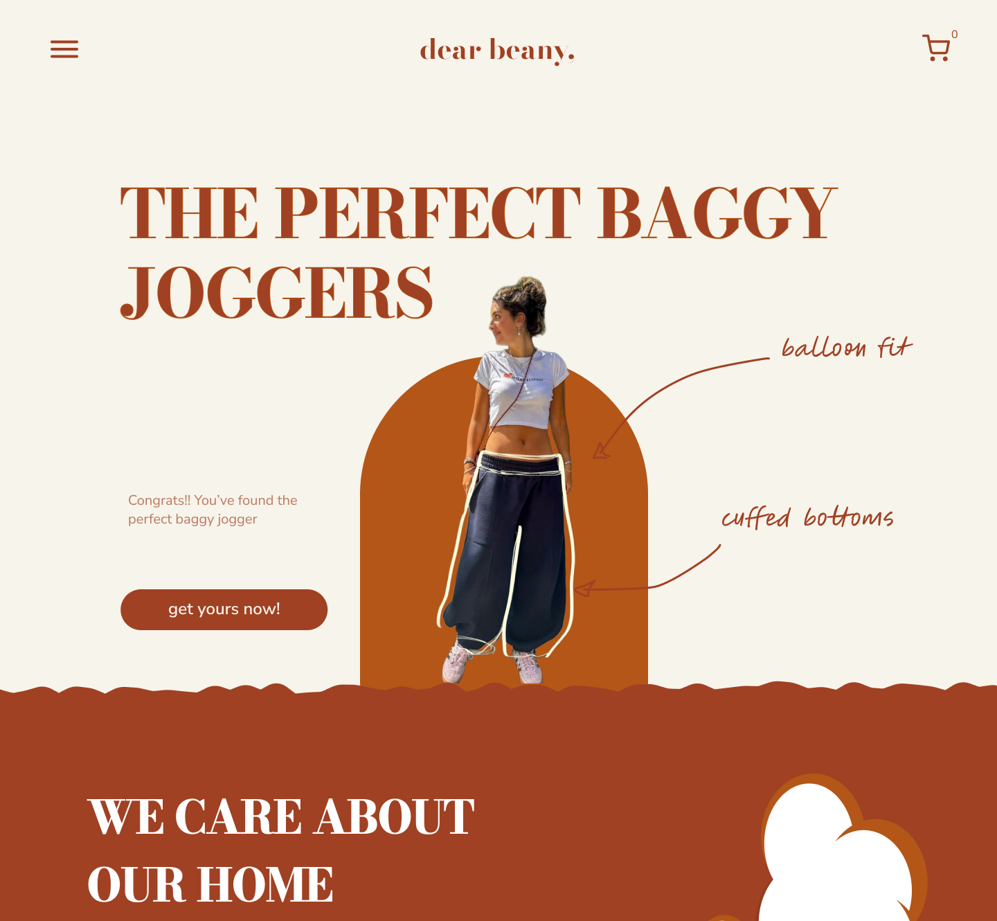
Dear Beany is a sustainable clothing and lifestyle brand centred on comfort, slow fashion, and conscious everyday living. I once bought their pants and from that first visit I decided to use their website as practice.
The challenge was to create a visual identity that communicated sustainability and warmth without clichés and well on the mobile devices. I have created many desktop designs with mobile designs but I haven't mainly focused on mobile. The plan was to keep the brands image and design elements to keep it natural.
This is a practice project not an actual client work design! I truly love Dear Beanys pants (as I own a pair) check their actual website!!
.png)
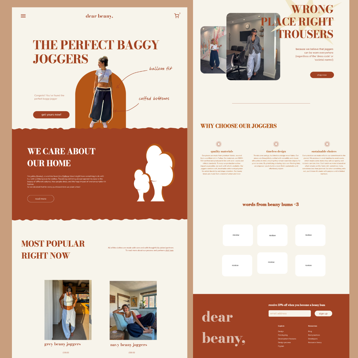
Visual showcase
The design
Design detail.
I wanted to keep elements from the old website design and really focus on their vibe. The typography is the same as the original website, spacing, and colour choices work together to create a brand that feels warm and considered. I did also want to showcase their love for the environment.
Clean layouts let the product breathe, while the terracotta accents draw attention without demanding it.
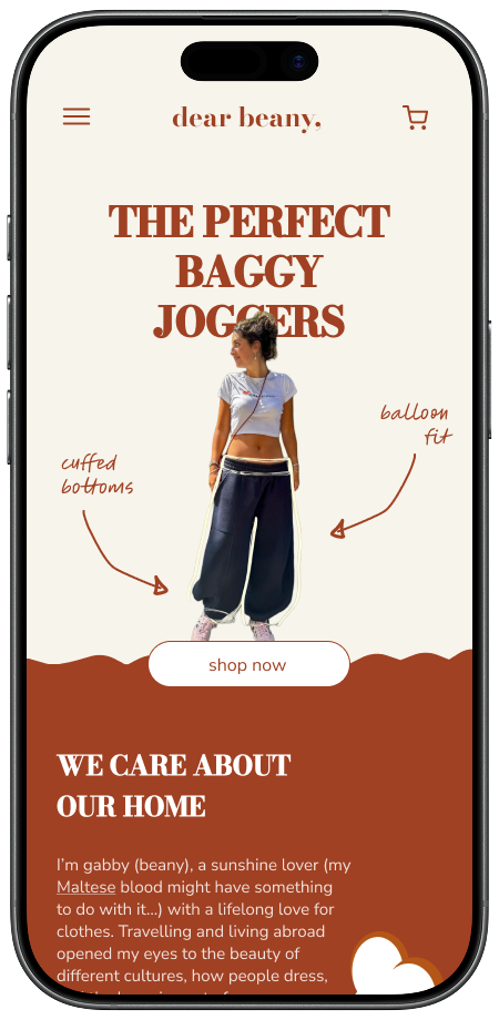
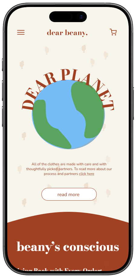
Mobile design
Designed mobile-first. every screen built for the smallest viewport first.
How I worked
The process
Colour palette & design in motion
The colours
The palette is rooted in the company's current website and social media posts.